Author: paschmann
Goodbye Canyon Lux
While prepping my bike for Leadville, I completely screwed up and managed to strip the hex head of the shock mount bolt. I subsequently used an easy out to get some grip on the bolt and start applying some rotational torque. In doing so, I missed the fact the bolt could be seized in the shock bushing 🙁 So while I thought I turning the bolt out, I was implying “pushing” the back of the shock stay outward, and it cracked the frame 🙁
Sweating I reached out to Canyon, explained the situation, and they kindly warranted it! Part of the claim process was to destroy the old frame so after ~ 4,814 miles, it’s gone in the trash can. Some good memories on this bike for sure!
Travel: Atlanta, GA
Big South volleyball with Charlotte and Ella. A hectic weekend with both of them participating. We stayed in the Hilton about 15 minutes walk to the Georgia World Convention Center.


DIY – Canyon Garmin Mount
My second CNC project on the Carvera Air is a Garmin mount for my MTB. I have 3D printed these in the past, but thought it would be a good introduction to CNC. I also made a small water bed to cut the Carbon Fiber in to avoid the nasty dust which is generally made when cutting or sanding it. Fun weekend project!


Things can and did go slight wrong 🙁 This is what happens if the glue does not hold!

List: Software
A list of applications which I have used extensively and relied on for various reasons, scenarios or situations.
| Software | Description | Notes |
|---|---|---|
| Winamp | Mp3 Player | No comment needed. A staple for many years along with the mesmurizing visualizations. |
| Sony Vegas | Video Editing Software | Used for many of my “home videos” starting in around 2002. Switched to Adobe Premier Pro in 2010 |
| Adobe Premier Pro & After Effects | Video Editing Software | Continued to create “home videos” using Premier. I think the plugins and integration with AE is what enticed me to move away from Sony Vegas. One of those plugins was camera tracking, which I used in the intro for one of the videos. |
| Evernote | Note Taking | After 14+ years of using Evernote as my “second brain” I switched to Obsidian in 2024. |
| Quicken | Finance | As of 2025, I have 22 years of financial transactions categorized and reported. I originally started tracking my expenses using Microsoft Money and shortly after switched to Quicken. |
| Adobe Illustrator | Vector Design | Compared to some of the others on this list, it is a more recent addition to my “often used” tools. I only really started seeing and understanding the value of vector based design once we got a laser cutter in ~ 2018. Having the ability to scale designs was a necessity and since, it has gotten more use compared to PS. |
| Adobe Photoshop | Photo, Graphic Design | Another long running constant in my suite of software I regularly use. I started with a free trial of Corel Draw (6?) in 1995 from a “Demo” version on the cover of the PC Shopper magazine, and then later switched to Adobe. (Around 4.0) |
| Filezilla | FTP | |
| Visual Basic / Studio | Code Editor | Another staple which I first was introduced to from a Demo version on the cover of a Computer mag ~ 1995 – version 4.0 or 5.0 was my initial introduction with some basic tutorials and sparked my love for software development 🙂 |
| Adobe Dreamweaver | Code Editor | Spent a ton! of time in Dreamweaver as my preferred web development IDE in the Web 1.0 days … |


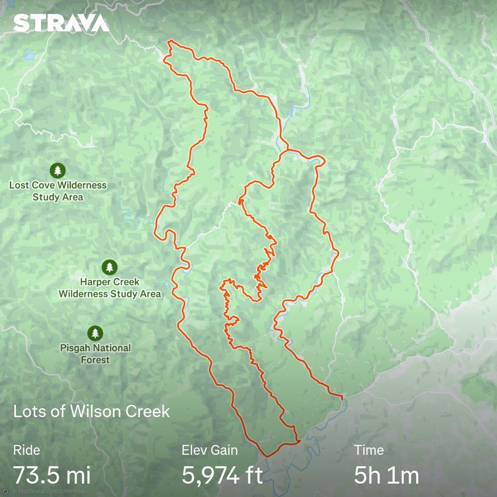
Memorable Rides: Wilson Creek Gravel


Rule of least power

Rule of least power – Wikipedia
From Wikipedia, the free encyclopediaTime <> Money
Time is more valuable than money. You can get more money, but you cannot get more time. – Jim Rohn
2024 Ironman All World Athlete
I am a marketers dream and loyalty programs were invented for me 🤣 … fun to have some small recognition as a AWA Gold Athlete in 2024/2025 again.


New Bike Day! 2025 Speedmax CF SLX
Finally outside after speeding the first couple hundred miles on the trainer 🙂


You must be logged in to post a comment.