There is something quite refreshing about volunteer work. Generally it’s a position or job which you have picked because you have expertise, passion or interest in learning more about. It is unpaid, and the external pressure and expectations you get from a paid position are generally non-existent.
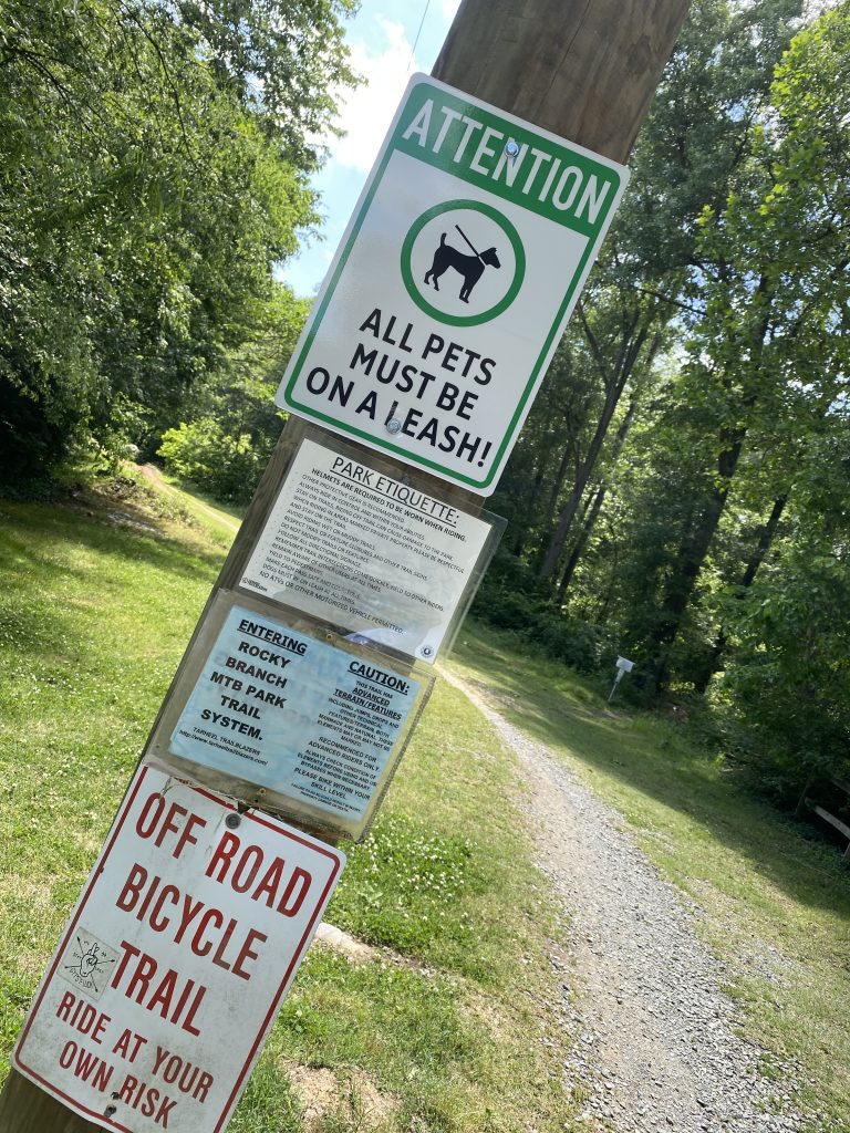
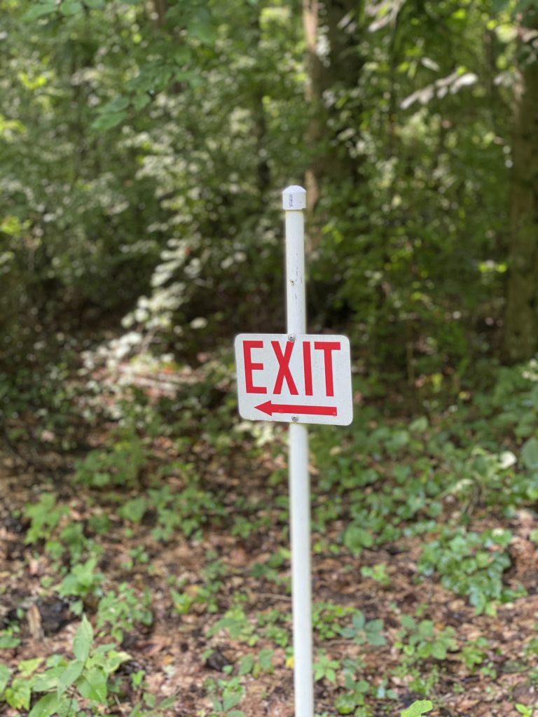
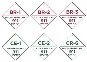
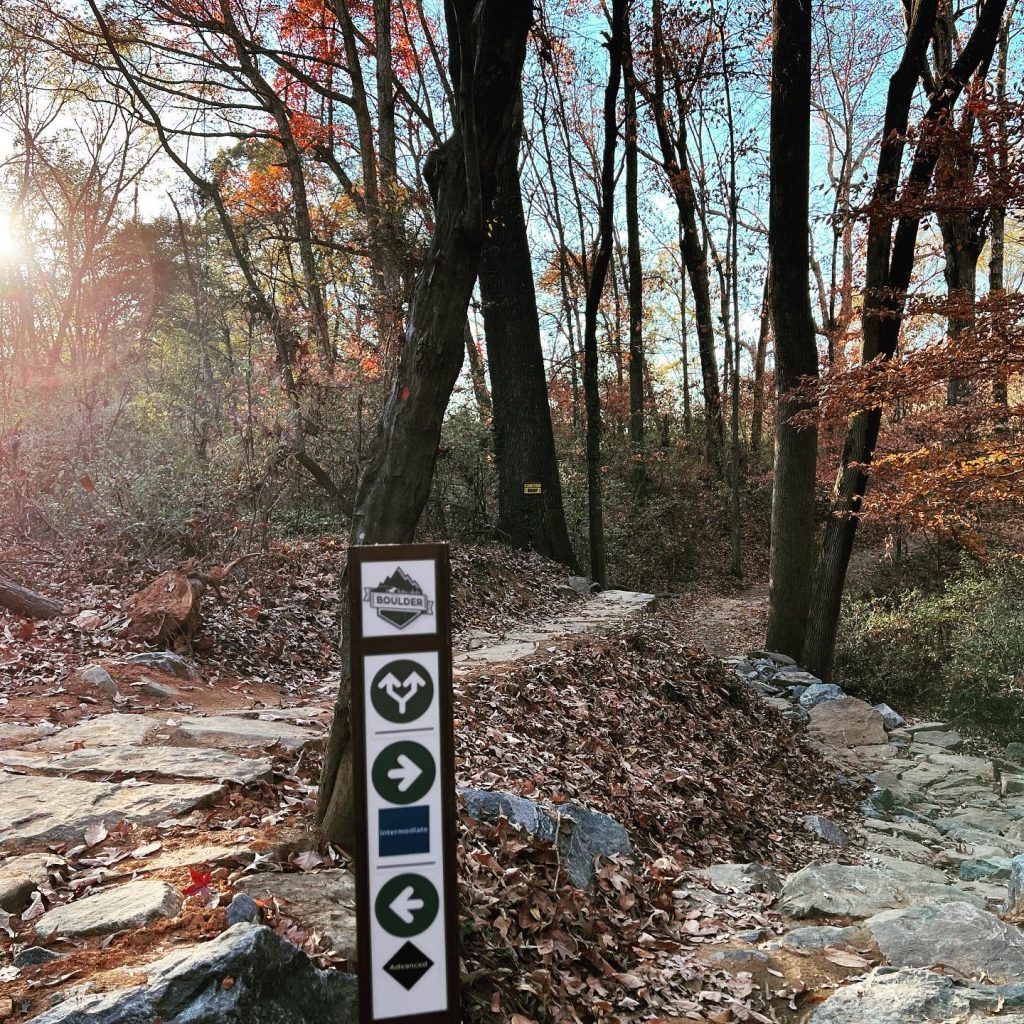
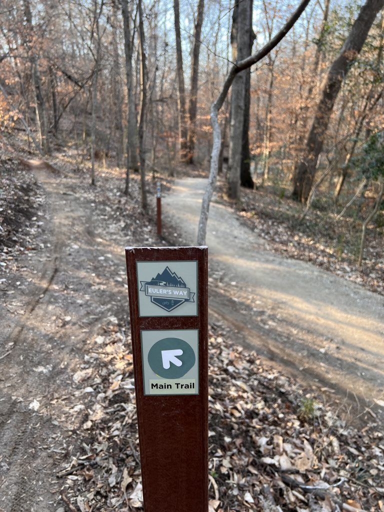
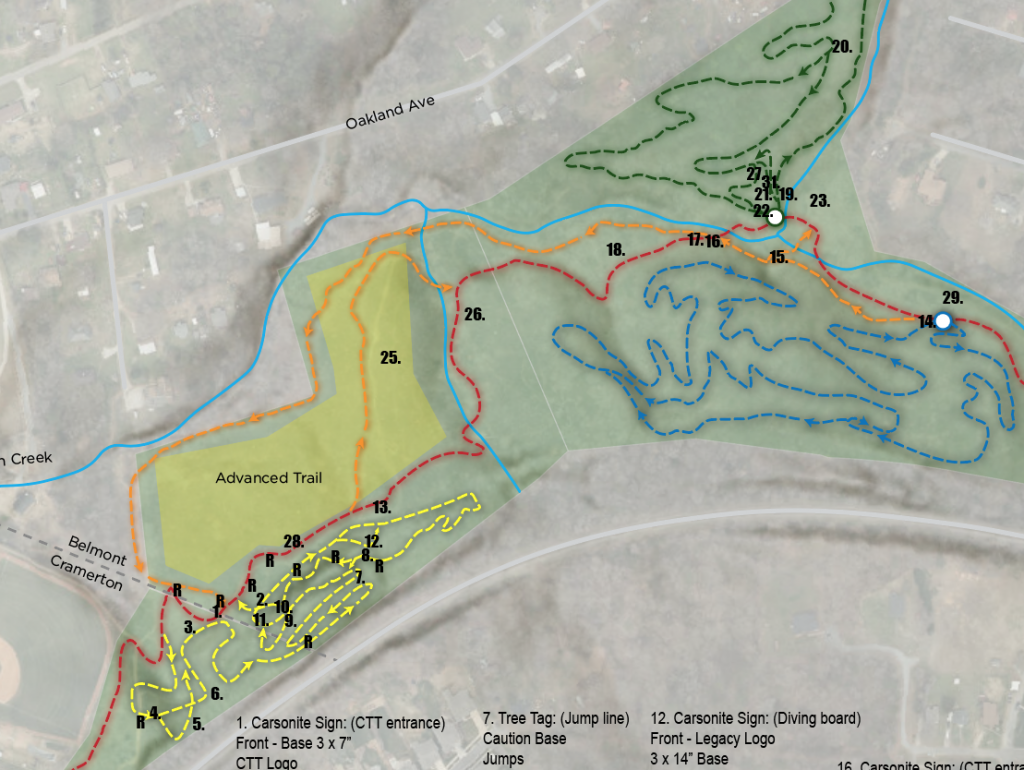
While I have had, and do, multiple volunteer jobs for one of the parks in the Tarheel Trailblazers organization, taking on new responsibilities is rewarding from a knowledge building perspective. This role was centered around designing, installing and maintaining a mountain bike/hiking parks signage. The project included the main entrance information boards, way finding, and safety signs.
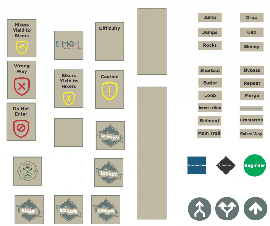
Designing signs is a lot like designing apps or software, when you break down the fundamental elements into bite sized chunks, creating a complete and informative sign become intuitive to both create, and consume.
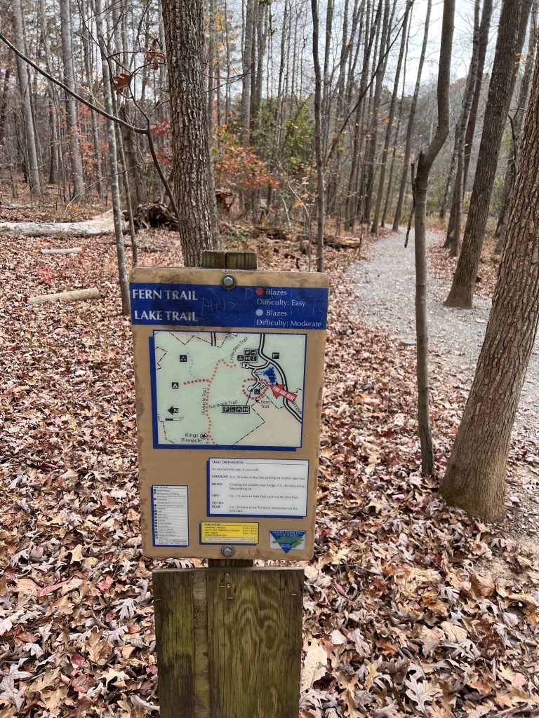
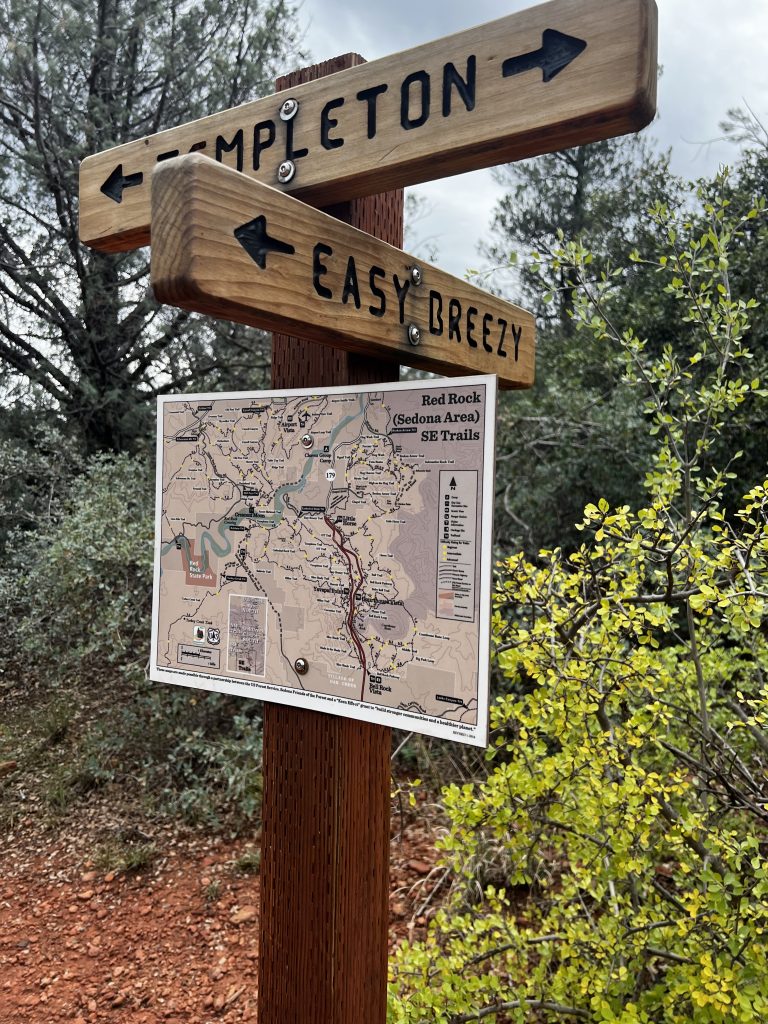
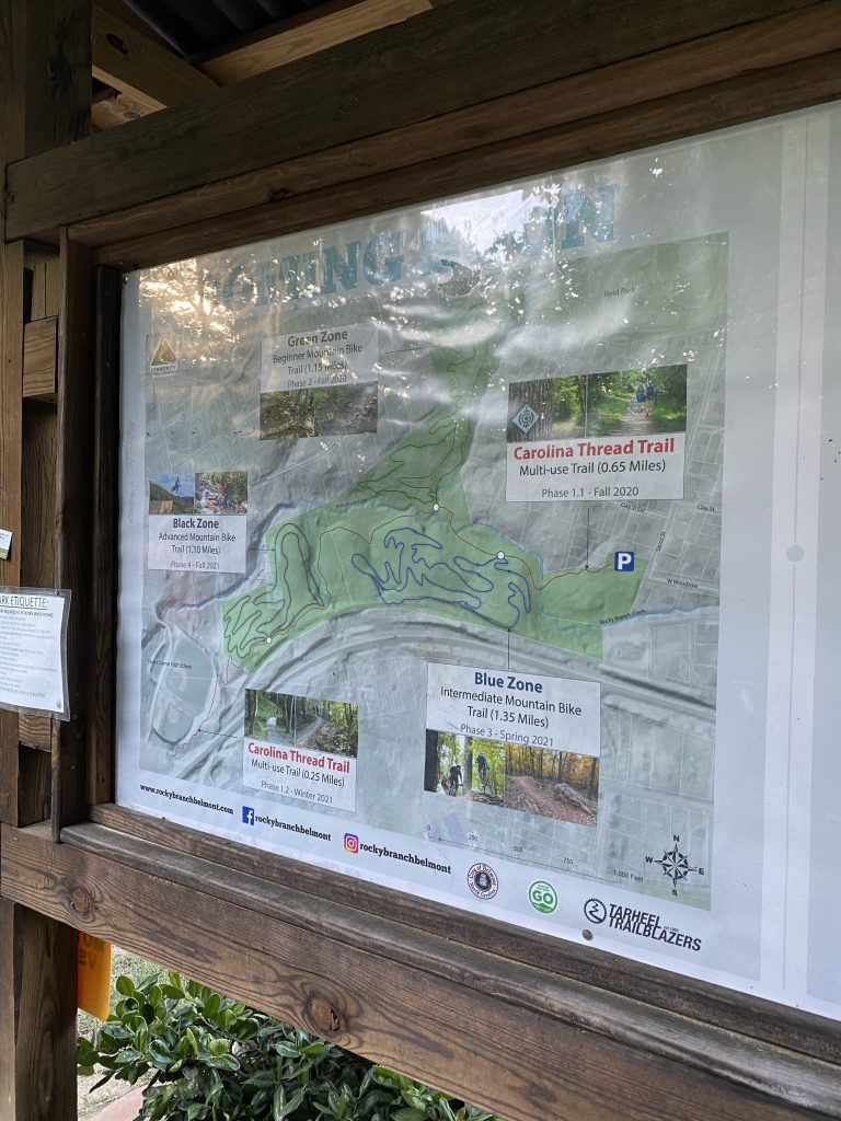
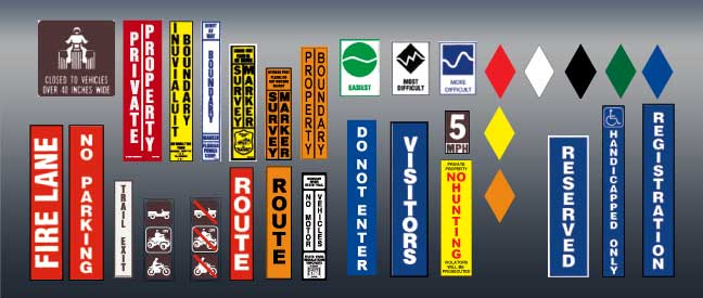
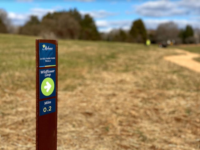
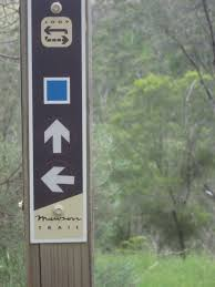
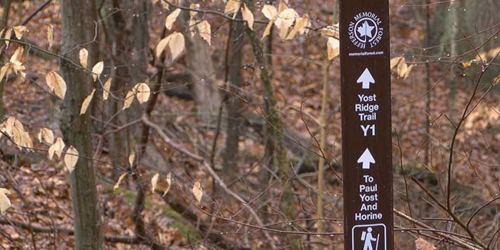
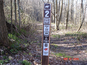
Like a traditional design project, I spent a considerable amount of time drawing inspiration from national, regional, state and local parks. Snapping pictures everywhere I went and looking up way finding signs online. Here are a couple of elements which were acclaimed or suggested as “good” or easy to read.
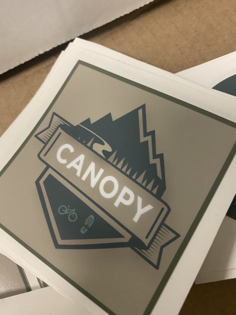
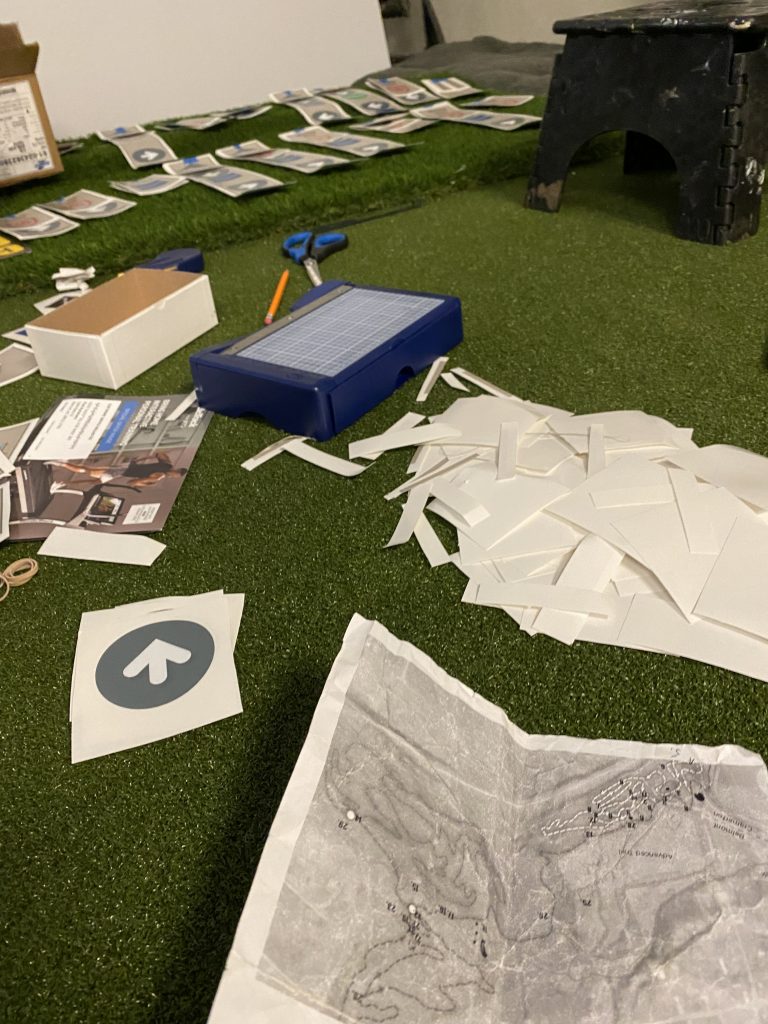
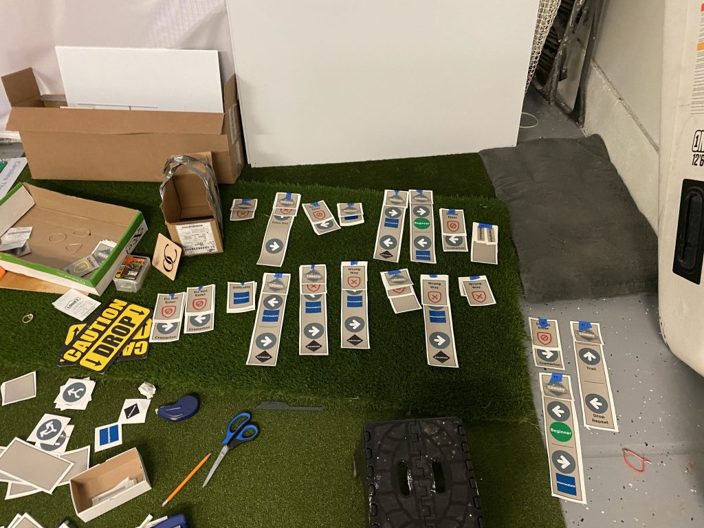
Drawing from some of the inspirations and designs I started a design language with templates, fonts and common elements which makes up each sign. This was done using vectors in Adobe Illustrator.
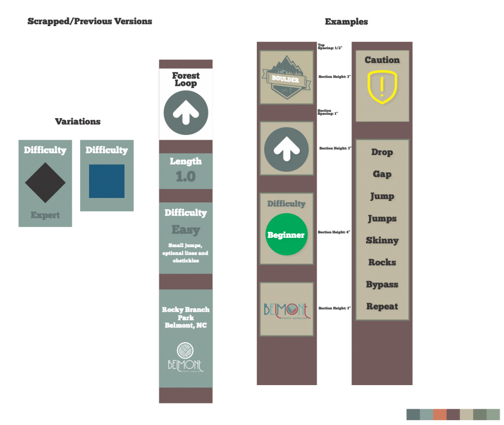
Once we had a variety of signs we ran a small experiment by printing a few of the signs, installing them and doing tests by both walking and riding by the signs to see if they were effective and test various colors and contrasts.
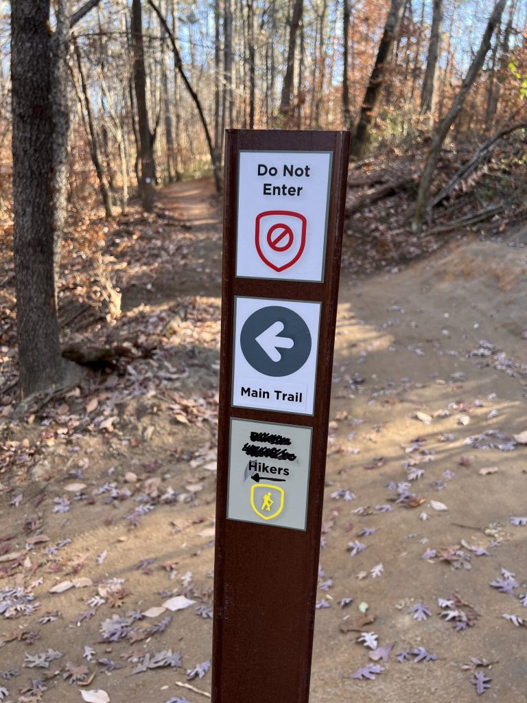
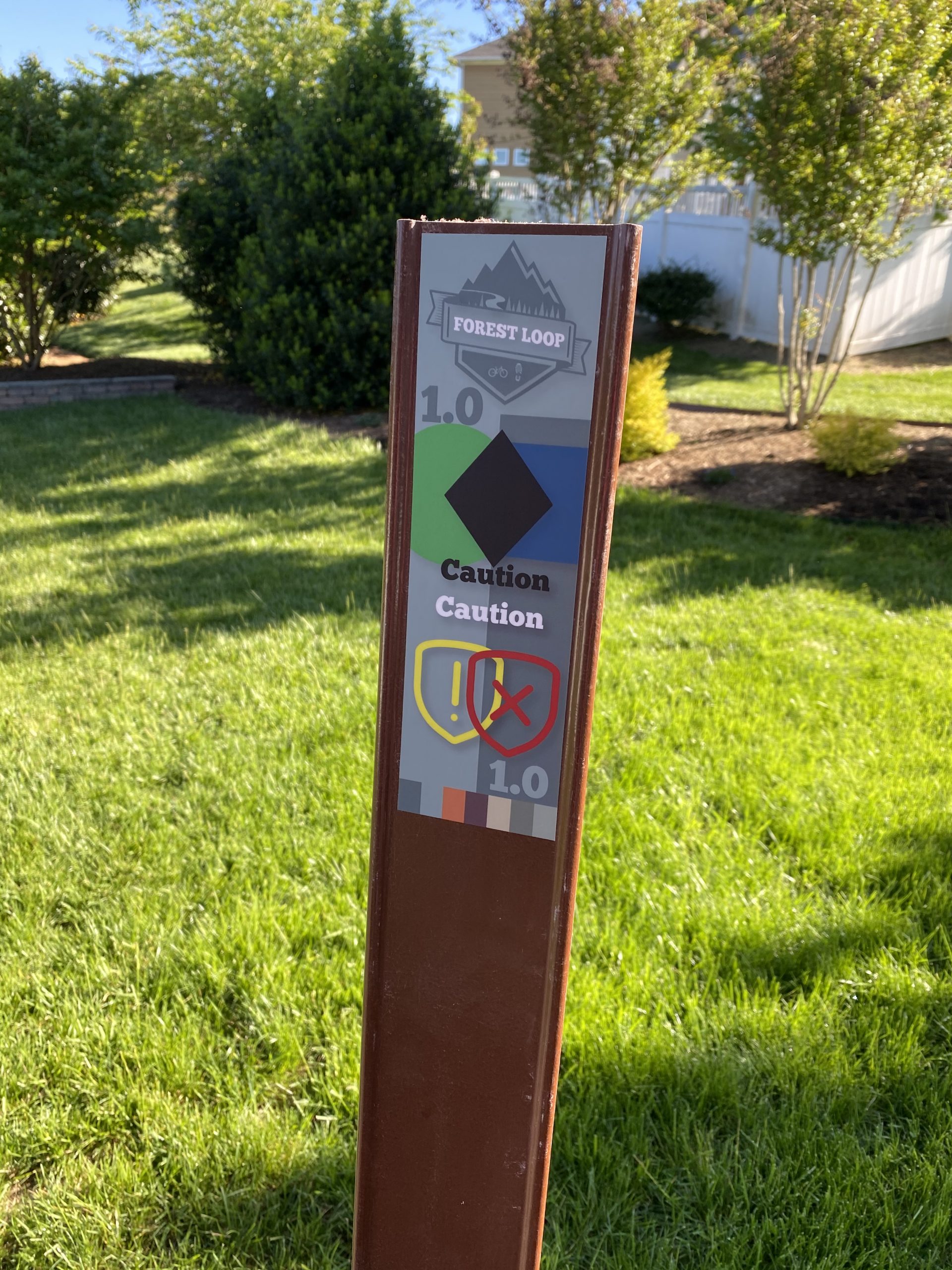
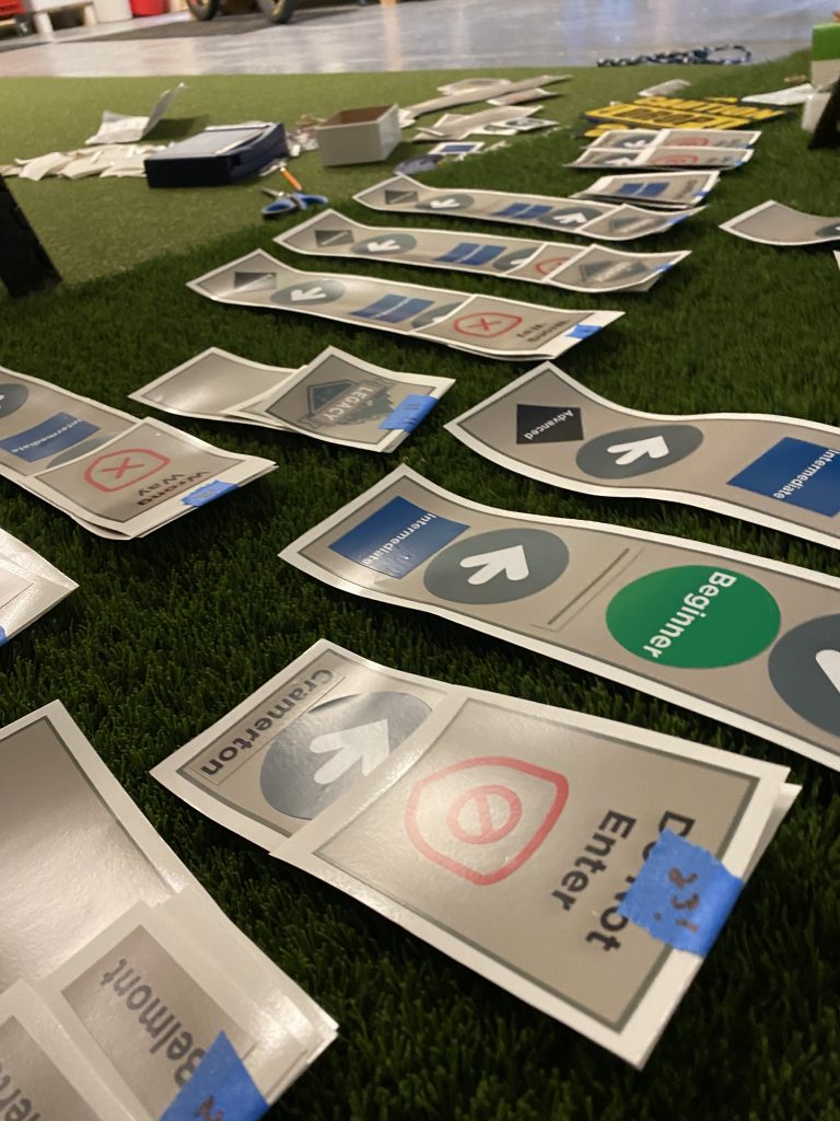
Once the we had reviewed and decided on the final design, colors and layouts, printing and installation got started. I have received some constructive and interesting feedback going through this process, like software and app design, physical signage is a very subjective “art”. What is clear and intuitive to one person, may not necessarily convert or be understood by another. What works well for hikers, may not be great for cyclists. Some people feel too much signage ruins the natural ambiance, while others feel they are getting lost. Inevitably design experience, user understanding and feedback are the most important elements when working through a project like this to ensure a balanced result.
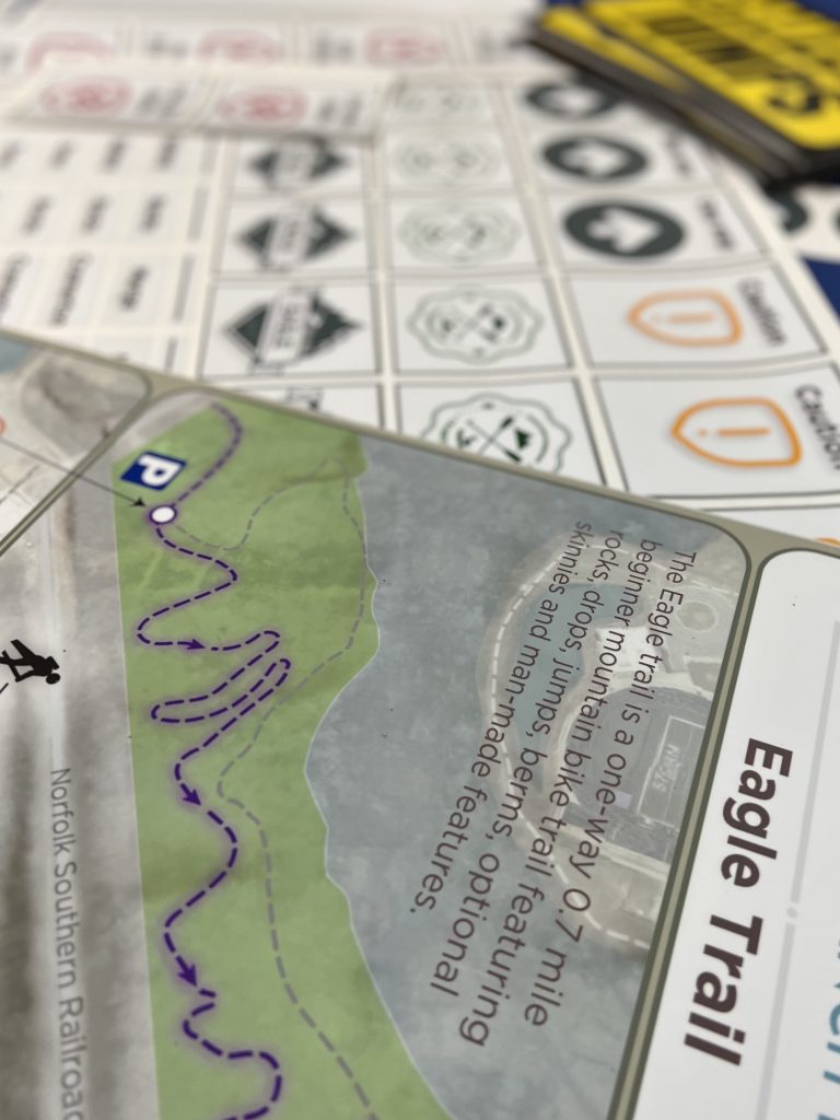
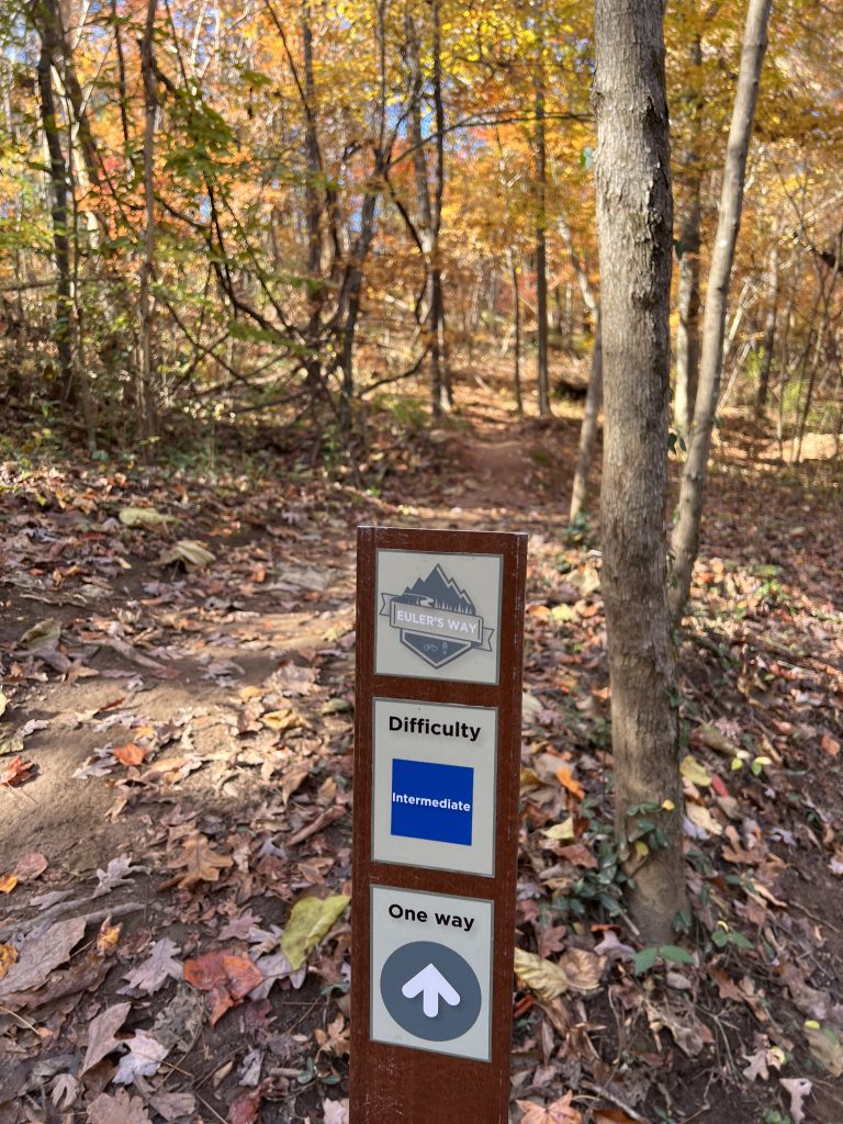
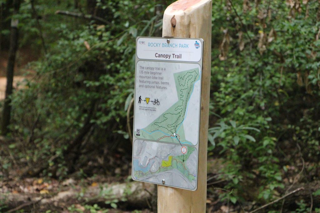
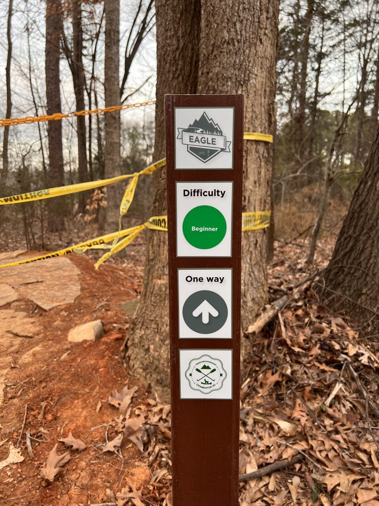
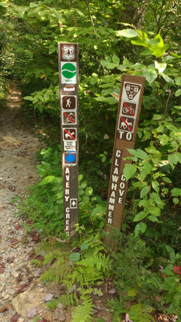
Here are a few pictures from some of the +- 300 symbols and signs the park has over the 6 miles.

Project Inspiration:
You must be logged in to post a comment.